

- Why you need to know how to describe a graph
- How to describe a graph
- Introduce the graph
- Identify key features
- Point out important information
- Share your conclusions
- How do you describe a line graph?
- How do you describe a bar graph?
- How do you describe a pie chart?
- How to choose the correct language for a chart presentation
- Introductory phrases
- Verb tenses
- Essential graph terms
- Essential chart terms
- 6 tools for creating graphs and charts
- Microsoft Excel Online
- Google Sheets
- Tableau Public
- Plotly
- Canva
- Infogram
- Improve your graph presentations with online Business English tutors
- Frequently Asked Questions
- Why should I use charts, graphs, and diagrams in my presentation?
- What are the key steps in describing a graph?
- How can I effectively describe trends in a line graph?
- What tools can I use to create graphs and charts?
- How can online Business English tutors help with my presentation?
Are you preparing to deliver a presentation? Want to capture your audience’s attention? Utilizing charts, graphs, and diagrams can significantly enhance your presentation and engage your listeners effectively.
Mastering the ability to convey data in a clear and engaging manner not only establishes you as a knowledgeable authority but is also essential for success in the IELTS exam, a key English-language assessment for non-native speakers worldwide. One of the exam tasks typically involves interpreting and discussing diagrams or visuals filled with figures and facts. Let’s explore some useful vocabulary and phrases to effectively describe charts and graphs.
Why you need to know how to describe a graph
Many presentations tend to revolve around data and statistics, which can come across as dull. But it doesn’t have to be that way! To captivate your audience, incorporate essential business phrases along with engaging visuals like charts, graphs, and diagrams. These elements not only enhance your presentation but also provide compelling, evidence-based insights that keep listeners interested.
When showcasing data through charts, graphs, and diagrams, it’s essential to help your audience grasp and remember the key insights. Visuals are powerful tools for illustrating trends and highlighting relationships between multiple elements, making complex information more accessible and engaging.
How to describe a graph
After crafting an eye-catching graph for your presentation, the next step is to master the art of describing graphs, charts, and diagrams effectively. Let’s explore the key steps involved in this process.
Introduce the graph
Your first step should be to present the graph to your audience. This means covering high-level information like:
- Its title
- The topic
- Data source
- Time frame
Here are some examples of how to do this:
- This graph shows the relationship between X and Y.
- This diagram is a visual representation of the process for…
- This chart uses data from the Z Database.
- The data in this graph is from 2020.
Identify key features
Next, let’s explore the essential variables depicted in the graph. Typically, graphs and charts feature an x-axis and a y-axis, each representing distinct variables. By clearly describing these axes, you’ll enhance the audience’s understanding of how the data is presented and interpreted within the graph.
Here are some helpful phrases for identifying these variables:
- The vertical axis shows…
- The horizontal axis represents…
- This curve illustrates…
- The solid line shows…
- The shaded area describes…
- This colored segment is for…
- The red bar…
Point out important information
When interpreting graphs, begin by identifying the key patterns, trends, or relationships they reveal. For instance, if a chart illustrates a noticeable rise in revenue over the past year, make sure to emphasize that observation right away.
To effectively convey the movement of the line, it’s essential to select the right verbs, adjectives, and adverbs based on the specific action you wish to illustrate. Consider using the vocabulary provided to enhance your descriptions.
- **Verbs Related to Change in Value:**
– **Increase:** rise, grow, climb, boom, peak
– **Decrease:** fall, decline, decrease, drop, dip, go down, reduce, plunge, plummet, crash, collapse
– **Stability:** remain stable, no change, stay constant, maintain the same level, level up - Adjectives: sharp, rapid, huge, dramatic, substantial, considerable, significant, slight, small, minimal, massive.
- Adverbs: dramatically, rapidly, hugely, massive, sharply, steeply, considerably, substantially, significantly, slightly, minimally, markedly, quickly, swiftly, suddenly, steadily, gradually, slowly.
You can also identify other notable information, like outliers. This shows you understand the data beyond the surface level.
Share your conclusions
After analyzing the graph, it’s essential to delve into its significance. To spark your thoughts, consider posing questions such as:
- How does this data affect the future?
- How can we learn from this data?
- What can we do differently to improve?
- What decisions should we make based on this data?
Some ways to explain your conclusions include:
- Based on the graph, we can conclude that…
- This chart indicates that…
- User growth has risen over the past year, indicating an expected increase in users over the next six months.
How do you describe a line graph?
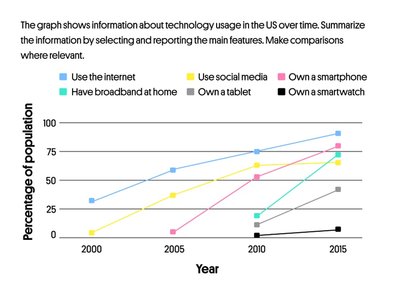
This type of graph presents data as points plotted on a grid, interconnected by lines that illustrate trends, changes, and relationships among various elements such as objects, numbers, dates, and more. The lines effectively demonstrate how key factors influence movement over time, highlighting increases or decreases in values.
When analyzing the graph, trace its movement along the horizontal axis and note whether it rises, falls, or remains flat. Below is an example of a line chart accompanied by a sample IELTS exam question:
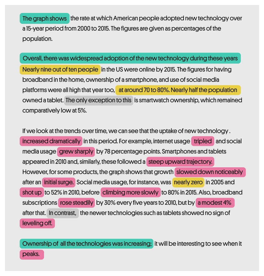
The appropriate vocabulary below will help you understand how to describe such charts:
How do you describe a bar graph?
Bar graphs present data as distinct bars or columns, making it easy to visualize and compare information. Typically, the x-axis displays categories while the y-axis represents numerical values. This format enables you to effectively compare statistical data across various groups over time.
Bar graphs are excellent tools for visually comparing categories, helping to easily identify which one is the largest and which is the smallest. Each category stands independently, meaning that changes in one do not affect the others. Additionally, the bars can be displayed either vertically or horizontally, providing flexibility in presentation without altering the data’s meaning.
When analyzing the graph, start by observing the trend from left to right. Note whether the values increase, decrease, or remain constant. The terminology for describing bar charts closely mirrors that of line charts. Now, let’s explore an example question from the IELTS writing test:
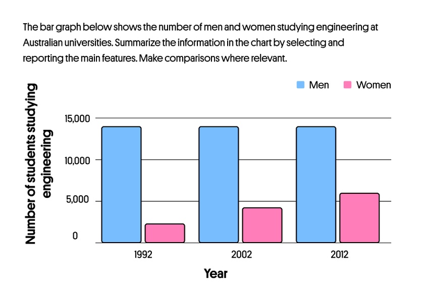
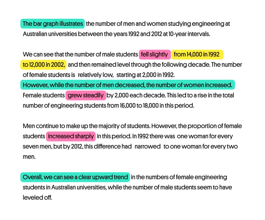
Here’s a fantastic example of bar graph analysis from the British Council, crafted in response to an exam question. Additionally, you can enhance your presentation by incorporating the following vocabulary specifically tailored for discussing bar charts.
How do you describe a pie chart?
The pie chart effectively demonstrates how various components contribute to a total. To make the most of your data presentation, focus on comparing each “slice” to understand its proportion within the overall structure. Here are some useful comparison words to describe the segments of a pie chart:
- to compare
- compared to
- as opposed to
- versus
- more than
- the majority of
- only a small monitory
- greater than
- less than
Take a look at this pie chart illustrating the browsing preferences of internet users aged 16 and older. It provides a clear visual representation of how different methods of online access are favored among this demographic.
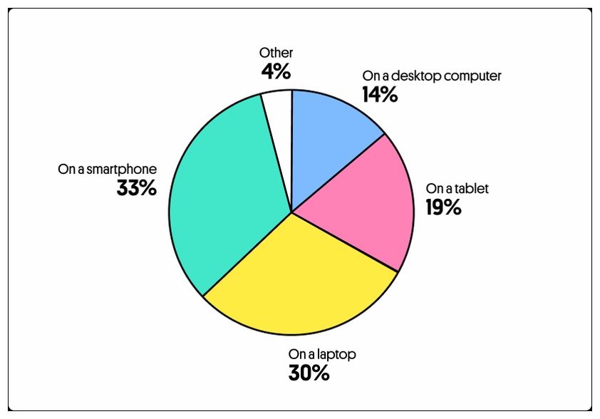
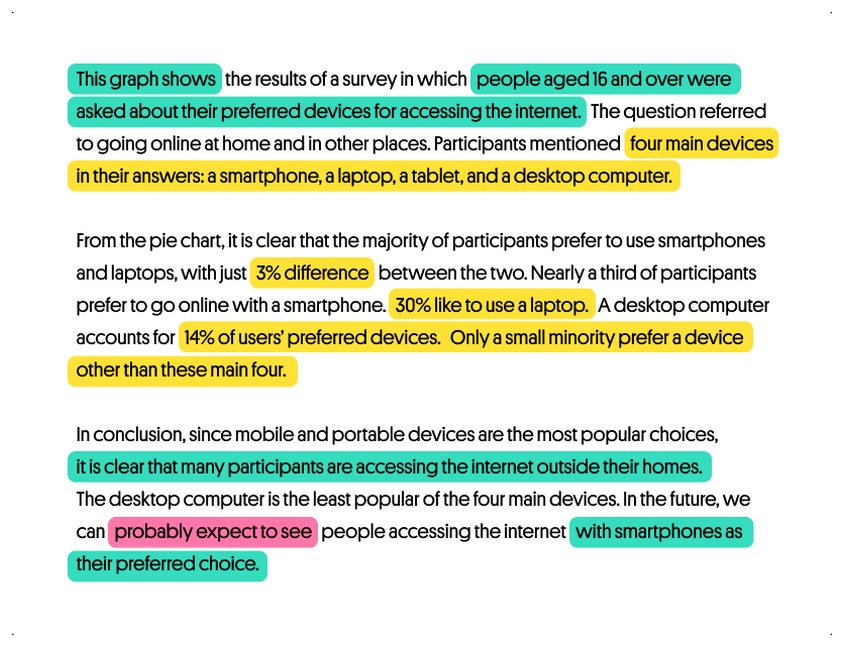
The example below demonstrates the best way to summarize data by selecting and reporting the main features:
How to choose the correct language for a chart presentation
Now that you understand how to describe various charts better, let’s zoom out to the presentation in general.
Introductory phrases
To catch your audience’s attention from the very beginning, you can use the following phrases for introduction:
- Let me show you this bar graph…
- Let’s turn to this diagram…
- I’d like you to look at this map…
- If you look at this graph, you will notice…
- Let’s have a look at this pie chart…
- If you look at this line chart, you will understand…
- To illustrate my point, let’s look at some charts…
Verb tenses
When analyzing graphs, paying attention to grammar is crucial, particularly in selecting the appropriate verb tense. To enhance your description, consider asking yourself the following questions as you examine the graph:
- Is this data from the past, present, or future?
- Does this graph represent the same point in time?
- Is this graph predicting the future?
Depending on your answers, you’ll end up choosing different tenses. Let’s take a look at these bar charts:
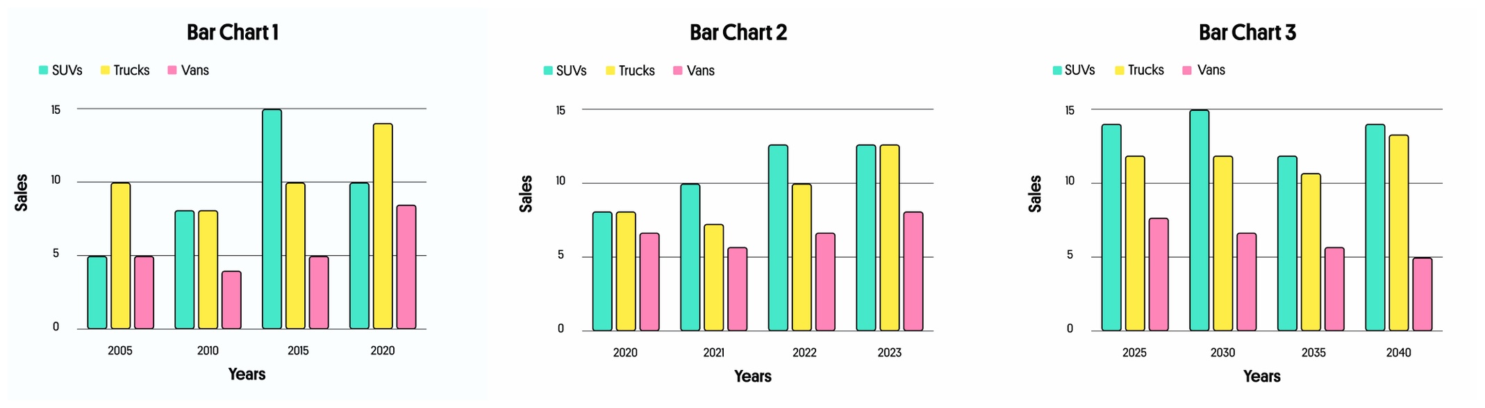
At first glance, these bar charts may appear identical, but a closer inspection reveals that each one corresponds to a distinct time period. This difference means that each chart will necessitate its own specific verb tense.
Bar Chart 1 presents historical data, which calls for the use of the English past simple tense. For instance, we can say, “Sales of SUVs rose between 2005 and 2015, then fell by 2020.”
Bar chart 2 presents a comparison of past and present data, making it ideal for using the English present perfect tense. For instance, we can say, “Sales of trucks have gradually increased since 2020.”
Bar chart 3 presents future data predictions, indicating that we should utilize the English future simple tense. For instance, we can say, “We anticipate that van sales will decline starting in 2025.”
Essential graph terms
- Vertex (or Node): A fundamental unit of a graph, representing a point or an entity.
- Edge: A connection between two vertices in a graph, representing a relationship or interaction.
- Directed Graph (Digraph): A graph featuring edges that indicate one-way connections between vertices.
- Undirected graph: A graph in which edges have no direction, and the connections between vertices are bidirectional.
- Weighted Graph: A graph where each edge has a numerical weight, indicating cost, distance, or other metrics.
- Degree: The total number of edges connected to a vertex. In directed graphs, it is categorized into in-degree (incoming edges) and out-degree (outgoing edges).
- Adjacency: A pair of vertices is said to be adjacent if there is an edge connecting them.
- Path: A sequence of vertices where each adjacent pair is connected by an edge.
- Cycle: A path that starts and ends at the same vertex, forming a closed loop.
- Connected graph: A graph in which there is a path between every pair of vertices.
- Disconnected graph: A graph with at least two vertices that do not have a path connecting them.
- Subgraph: A graph formed by a subset of the vertices and edges of a larger graph.
- Graph traversal: The process of systematically visiting all the vertices and edges of a graph.
- Connected components: The maximal connected subgraphs of a graph.
- Tree: A connected acyclic graph, where there is exactly one path between any two vertices.
- Forest: A collection of disjoint trees or disconnected components.
- Graph diameter: The length of the longest shortest path in the graph.
- Eulerian graph: A graph in which a single continuous path visits every edge exactly once.
- Hamiltonian graph: A graph that contains a Hamiltonian cycle, which is a cycle that visits every vertex exactly once.
- Isomorphic graphs: Two graphs are isomorphic when they share the same structure, meaning they have the same number of vertices connected identically.
These terms lay the groundwork for exploring graph theory, a fascinating area of mathematics that examines the properties and connections within graphs. Understanding these concepts is essential for meaningful discussions about this intriguing field.
Essential chart terms
- Axis: Reference lines on a chart that establish the data scale, usually comprising a horizontal (x-axis) and a vertical (y-axis).
- Data Series: A collection of related data points displayed on a chart, typically differentiated by unique colors or symbols.
- Data Point: A specific value or collection of values that represents a distinct element within the dataset, displayed on a chart.
- Legend: A key that explains the colors or symbols used to represent different data series on the chart.
- Title: A descriptive label that provides information about the content or purpose of the chart.
- Labels: Text that identifies and contextualizes specific chart elements, including axis and data labels.
- X-Axis: The horizontal axis on a chart that represents the independent variable or categories of data.
- Y-Axis: The vertical axis on a chart that represents the dependent variable or values of the data.
- Bar chart: A chart that uses rectangular bars of varying lengths to represent and compare data values.
- Line Chart: A graph that represents data points with connected line segments, ideal for visualizing trends over time.
- Pie chart: A circular chart divided into slices, each representing a proportion of the whole data set.
- Scatter Plot: A two-dimensional chart that visualizes the relationship between two variables by plotting individual data points.
- Area Chart: A variation of a line chart that fills the area beneath the line with color, visually representing the cumulative data effect.
- Stacked Bar/Column Chart: A visual representation where multiple data series are stacked vertically or horizontally, allowing for easy comparison of total values and individual contributions.
- Histogram: A chart that displays the distribution of a dataset, showing the frequency of different values or ranges.
- Doughnut Chart: A variation of the pie chart featuring a central hole, ideal for visualizing multiple data sets.
- Bubble Chart: A scatter plot that represents a third data dimension using the size of its markers.
- Axis scale: The range and increments on an axis, determining how data values are displayed.
- Gridlines: Lines on the chart that help in reading values and aligning data points.
Understanding these terms can enhance your ability to interpret and create effective visualizations.
6 tools for creating graphs and charts
Here are some of the best tools you can use to create graphs and charts, depending on your needs.
Microsoft Excel Online
- Cost: Free for basic features; full features available starting at $6.99/month for personal use
- Best use cases: Financial modeling and analysis, budgeting and financial planning
Microsoft Excel Online is the cloud adaptation of the renowned spreadsheet software Microsoft Excel.
Notably, it excels at creating charts and graphs, simplifying the process of data visualization. Its compatibility with other Microsoft Office online tools facilitates effortless data management and enhances collaborative efforts.
Google Sheets
- Cost: Free for individual users; G Suite for businesses starting at $6/user/month
- Best use cases: Collaborative projects, data collection through Google Forms, real-time data sharing and editing
Google Sheets is a versatile, cloud-based spreadsheet tool that’s part of Google’s suite of office applications.
Though it shares many features with Excel, its standout advantage lies in its effortless integration with other Google services such as Google Drive and Google Forms. Additionally, its powerful chart-making tools come with a variety of templates and customization options, enhancing your data visualization experience.
Tableau Public
- Cost: Free for public use; Tableau Desktop for private and professional use starting at $70/user/month
- Best use cases: Advanced data visualization, business intelligence and analysis, public data sharing and storytelling, interactive dashboards
Tableau Public is an exceptional data visualization platform designed for both beginners and experienced users. It empowers you to turn raw data into stunning, interactive dashboards and visuals, making complex information easy to understand and share.
A standout feature of this tool is its capability to publish and share visualizations with a wide online audience. With its intuitive drag-and-drop interface, it ensures that even those without technical expertise can easily create and share compelling graphics.
Plotly
- Cost: Free for basic use; professional cloud services starting at $20/month
- Best use cases: Scientific and engineering projects, integration with programming languages for custom visualizations
Plotly is an innovative online platform designed for data visualization and analysis, offering a wide array of chart types, from simple line graphs to complex 3D visualizations. What truly distinguishes Plotly is its interactivity; users can easily hover over data points, zoom in for a closer look, and pan across charts for a more engaging experience.
The platform also offers APIs for various programming languages, allowing developers to integrate and customize visualizations in their applications.
Canva
- Cost: Free for basic use; advanced features with Canva Pro starting at $12.95/user/month
- Best use cases: Social media graphs, marketing and promotional materials, infographics for blogs and websites
While Canva is primarily known as a graphic design platform, it also offers powerful tools for creating graphs and charts. Thanks to its user-friendly drag-and-drop interface, anyone can design bespoke charts easily, regardless of their design background.
With its extensive collection of free templates and design elements, along with powerful charting features, Canva has become a must-have tool for creating stunning visual data presentations. This platform is particularly favored by marketers, bloggers, and social media aficionados looking to enhance their content with captivating visuals.
Infogram
- Cost: Free for basic use; paid plans starting at $19/month
- Best use cases: Infographics for digital marketing, interactive reports and presentations
Infogram is a powerful digital platform designed for creating eye-catching infographics, charts, and maps. It makes it easy to transform complex data into compelling visual narratives that capture attention and enhance understanding.
A key highlight of Infogram is its capability to create interactive visualizations that boost user engagement. Its intuitive interface and diverse design options make it a popular choice for journalists, educators, and businesses looking to showcase data in an impactful way.
Improve your graph presentations with online Business English tutors
When designing charts for your presentations, aim for simplicity. Your charts, graphs, and diagrams should be self-explanatory. Utilize the vocabulary provided in this article to effectively describe your visuals and enhance your audience’s understanding of your data’s significance.
Preparing for an important presentation in English? Consulting an expert can make all the difference! At LingualNeeds, you’ll discover a vast selection of online business English tutors, eager to assist you with your language questions and ensure you deliver your presentation with confidence and professionalism.
Frequently Asked Questions
Why should I use charts, graphs, and diagrams in my presentation?
Charts, graphs, and diagrams significantly enhance your presentation by making complex information more accessible and engaging, helping to capture your audience’s attention.
What are the key steps in describing a graph?
The key steps include introducing the graph, identifying key features, pointing out important information, and sharing your conclusions.
How can I effectively describe trends in a line graph?
To describe trends in a line graph, trace its movement along the horizontal axis and note whether it rises, falls, or remains flat, using appropriate vocabulary for changes.
What tools can I use to create graphs and charts?
Some useful tools for creating graphs and charts include Microsoft Excel Online, Google Sheets, Tableau Public, Plotly, Canva, and Infogram.
How can online Business English tutors help with my presentation?
Online Business English tutors can assist you in preparing for your presentation by helping with language questions and boosting your confidence and professionalism.


